# Tours & Travels

# The Project
The Product: Tours & Travels is a travels deals and promotions website that target female audiences.
The Problem(s): We have many travels deasls websites out there but only few of them target experience and interaction with female. The client saw this business opportunities and came to my company for help.
Duration: 3 months
Role: UI/UX Senior Designer (Design + FrontEnd Dev Support)
Team Size: 3 people (Me + 1 Junior Designer + 1 PHP Dev)
Methods: Surveys, Card-Sort, User-Interview, Wireframe, Prototyping, cross browser testing.
Tools: Adobe Illustrator, TailwindCSS, PHP Laravel, BrowserStack.
# The Context
My design agency company helped building the website from start to finish.
First, we discussed with the client about the project and business goals. After we settled down the goals - Travel website that offers good experience & interaction with female audiences, the design team did the research and desgin, and development team did the website setup.
At the end, we made a website that combine PHP laravel technology and modern design together.
# Process

# User Interview
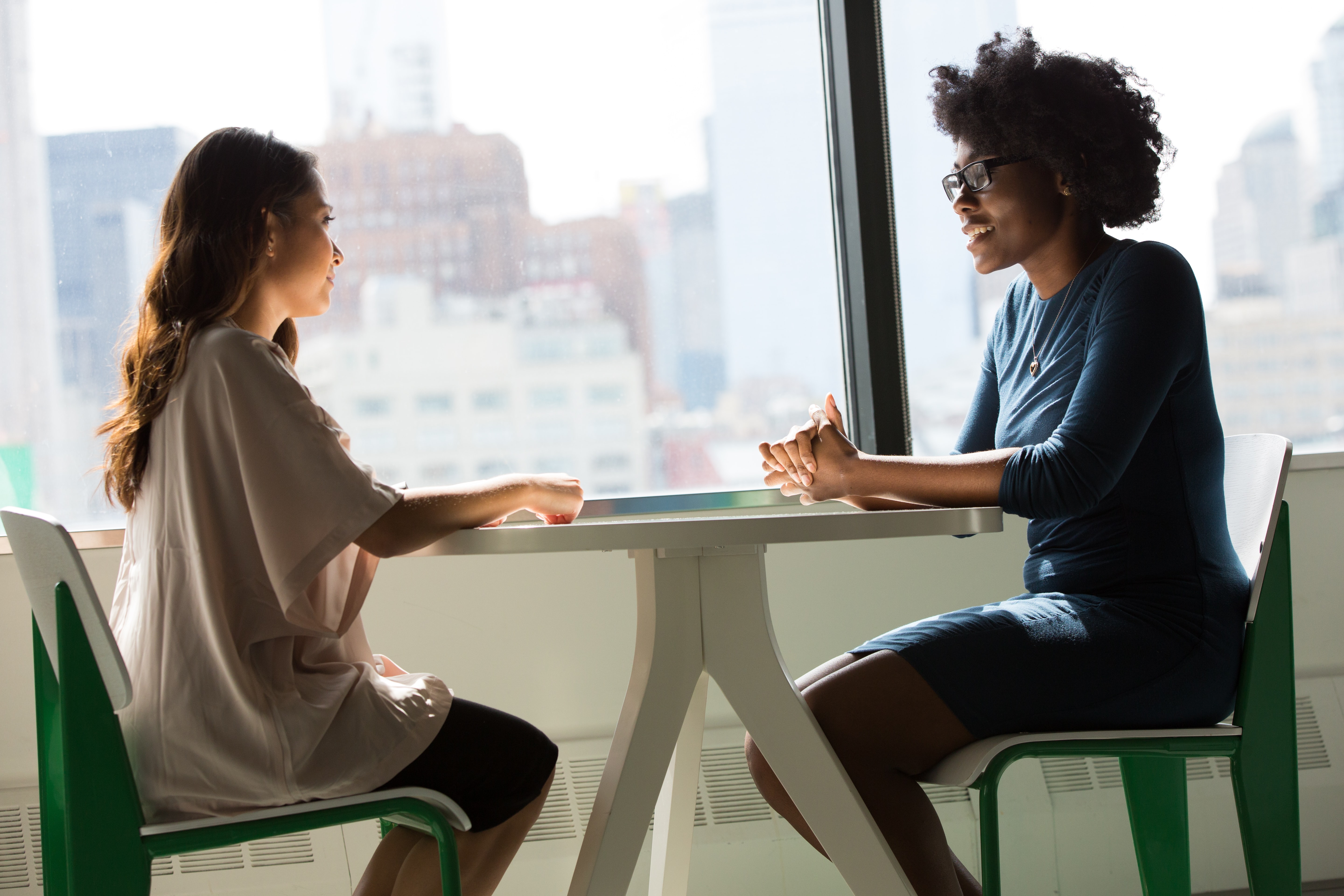
The design team went down to the street of Chicago downtown area to run the in-person user interview with our target audiences group. We prepared short and easy-to-answer Q&A, and we finished 100+ Q&A with females in the age group of 20 ~ 40 years old. In additional, we even went to cafes and malls to gather more users data.
# Card Sort
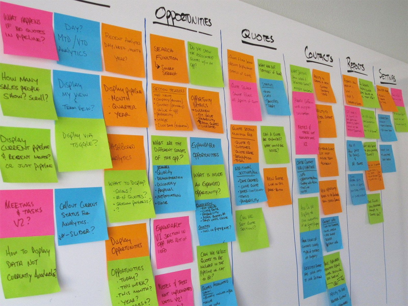
Tours-and-travels is not a traditional traveling website that is about deals and purchasing. In addition to user-interview, we also did the card-sort exercise with few target users groups.
# Key Findings & Insights
- Price is important, but I want to see the site that is about me.
- I want the travel website that understands female audiences thinking and feeling.
- Compare to data and prices, I would like to see photos instead.
- Social elements is important for me.
- Pink is cute, but I prefer a strong woman image instead of just cute.
# Visual Identity
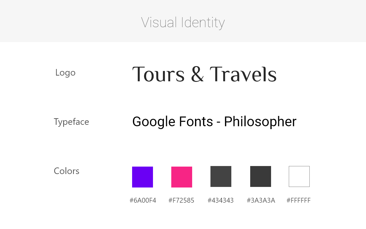
The client prefered a letting logo design with clean and modern feeling. And for the website body font family, we chose to use Philosopher which is feminine and strong at the same time. On the colors, we used modern purple to represent young and strong individual woman.
# Low Fidelity Wireframes
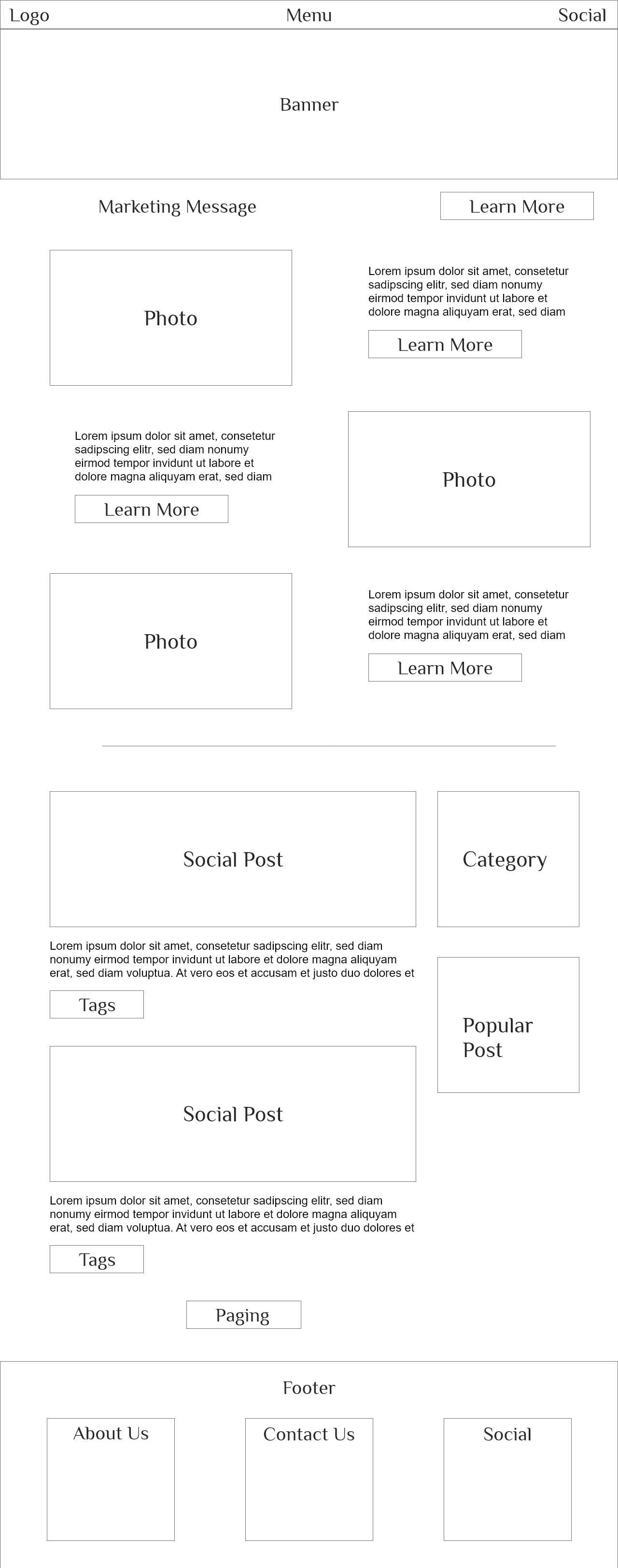
"Personal" and "Experience" are the biggest aims of this website. We used big banner and photo in the home page introduction area. We also added social-post, popular-post, and social links.
# Feedback / Design Changes
# Positive
- Banner and big photos using is good.
- Focusing on personal experience is good.
- Category shortcut is good so users can select what they want quickly.
# Negative
- Banner is good, but a modern (trending) full page banner would be nice.
- Photo / Learning More area's direction is difficult to follow.
- For social event, I would like to see pricing in small fashion.
- For the layout, too many straight lines and corners which give out masculine feeling.
# Final Product
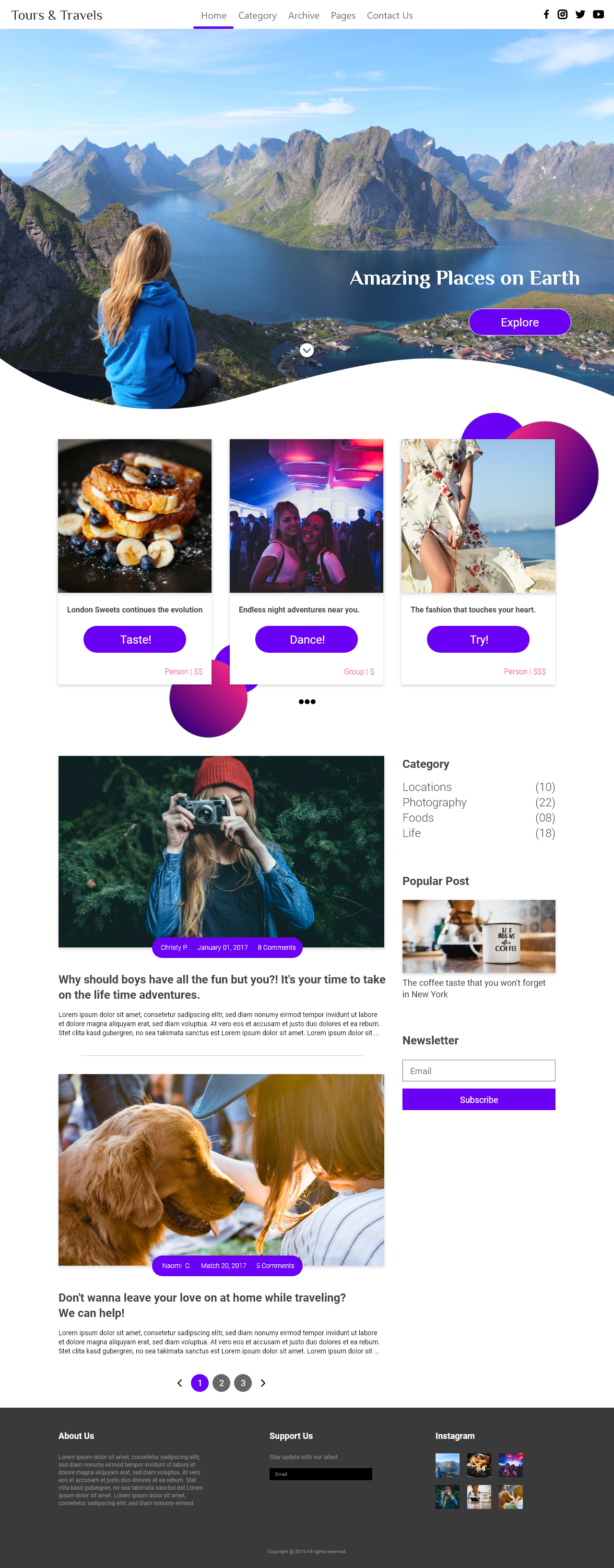
I made changes based on the user feedback. I created the high fidelity version of the website that featured full-page-banner, better-to-follow event posts, and more.
Desktop version
# Retrospective
Challenges
The biggest challenge was a struggle with the main goals of the project. As the project went on and on, we often forget why we build this website on the first place. Business side might want to find a way to gain revenue; Dev side might want to lower the cost and effort on front end interaction coding; Design side might forget who really is the target users.
What can be improved?
Even if it sounds old fashion, writing down the main goals of the project somewhere and forever is still very important for everyone in the team. When the project goes up and down, we still have a place to look at to remind us the goals and purpose.
Thank You.