# i18n Immigration Software

# The Project
The Product: International-Immigration-software is a simple web software to help companies on sponsoring and managing work visas in over the world.
The Problem(s): A B2B IT company located in the US that focuses on immigration process software. It has over 10 years of history and huge client base. Before I joinned that company, they had the software but it was badly out of date (Windows 95 style). They were looking for a refresh, so I joined them to rebuild the front-end and UIUX from the ground up.
Duration: 2 years
Role: UI/UX Architect (Design + FrontEnd)
Team Size: 30 people (Me + 3 Designers + 6 FrontEnd Dev + 20 BackEnd Dev)
Methods: Surveys, Card-Sort, User-Interview, Training, Wireframe, Prototyping, cross browser testing, Performance testing.
Tools: Adobe XD, Adobe Photoshop, AngularJS, Material Design, FontAwesome, Karma, BrowserStack.
# The Context
I joined the company as the UI/UX Architect who was in charge of UI/UX design and FrontEnd architecture. That International-Immigration-software was not bad at all. It was full of features but just lack of modern UI/UX and FrontEnd framework.
On the design side, we chose Material design philosophy. It outlines how apps should look and work on different devices. It breaks down everything such as animation, style, layout, etc.
On the FrontEnd side, we chose to use AngularJS since most of the developers there had a C++ background. It was a better choice for our situation. It shorten the learning curve so we were be able to finish the project within 2 years.
# Process
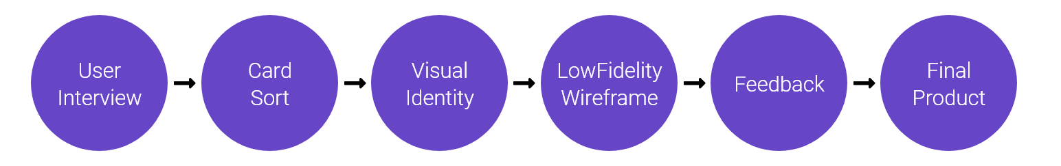
# User Interview
We setup premium user group meetings to gather information. Customers time is limited, so we setup short and easy-to-answer Q&A. We got many userful feedbacks such as features priority, users platform usage, preferred UI/UX interactions, and more.

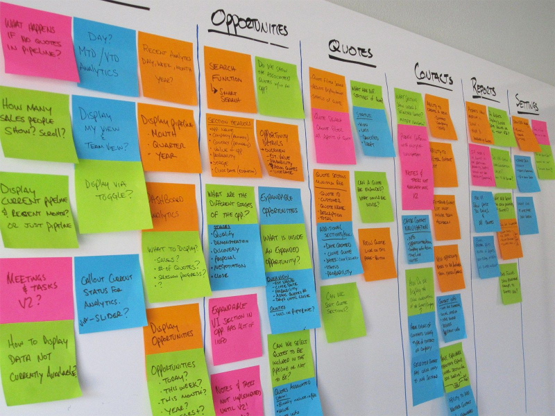
# Card Sort
The existing app was big. It had 8 different sub modules, 100+ APIs, and 100+ pages. We gotta make sure the user-flow is correct and smooth. It was a very important step.
We setup multiple card-sort meetings with users, developers, team leaders, etc to make sure the new user-flow matches the requirement, logic, local-law, and more.
# Key Findings & Insights
- We found out 2 sub modules' APIs were not re-usable.
- New design, FrontEnd, and APIs gotta fit perfectly for the tight deadline.
- i18n support is a must-have feature so we gotta be careful on different cultures and localization.
- Multi-talent support is a must.
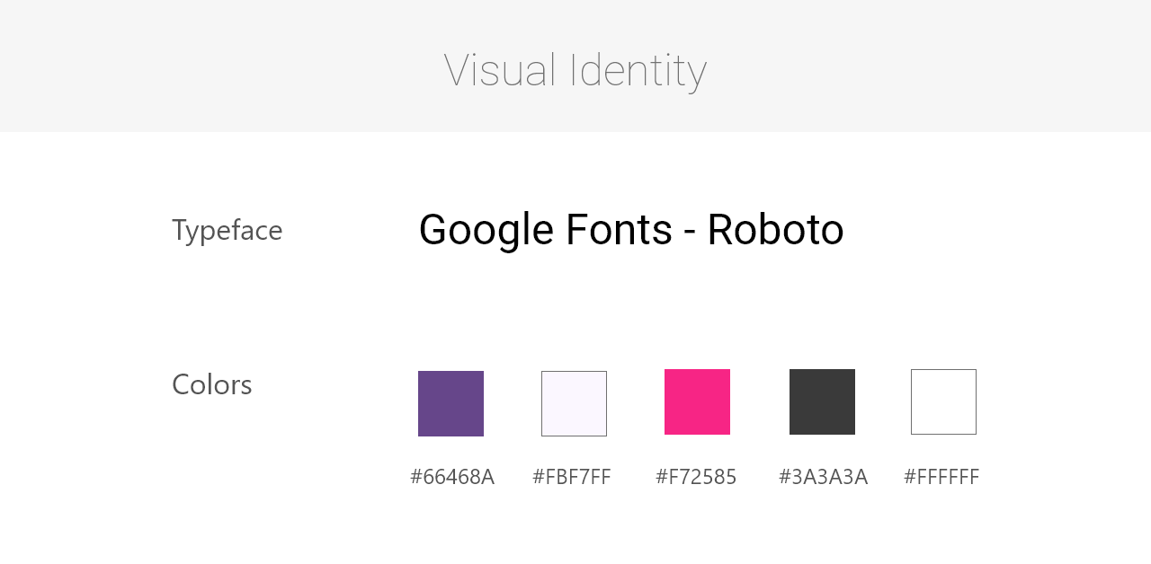
# Visual Identity
Violet purple was the company's color. We created color spectrum based on company color and customized the material design system.
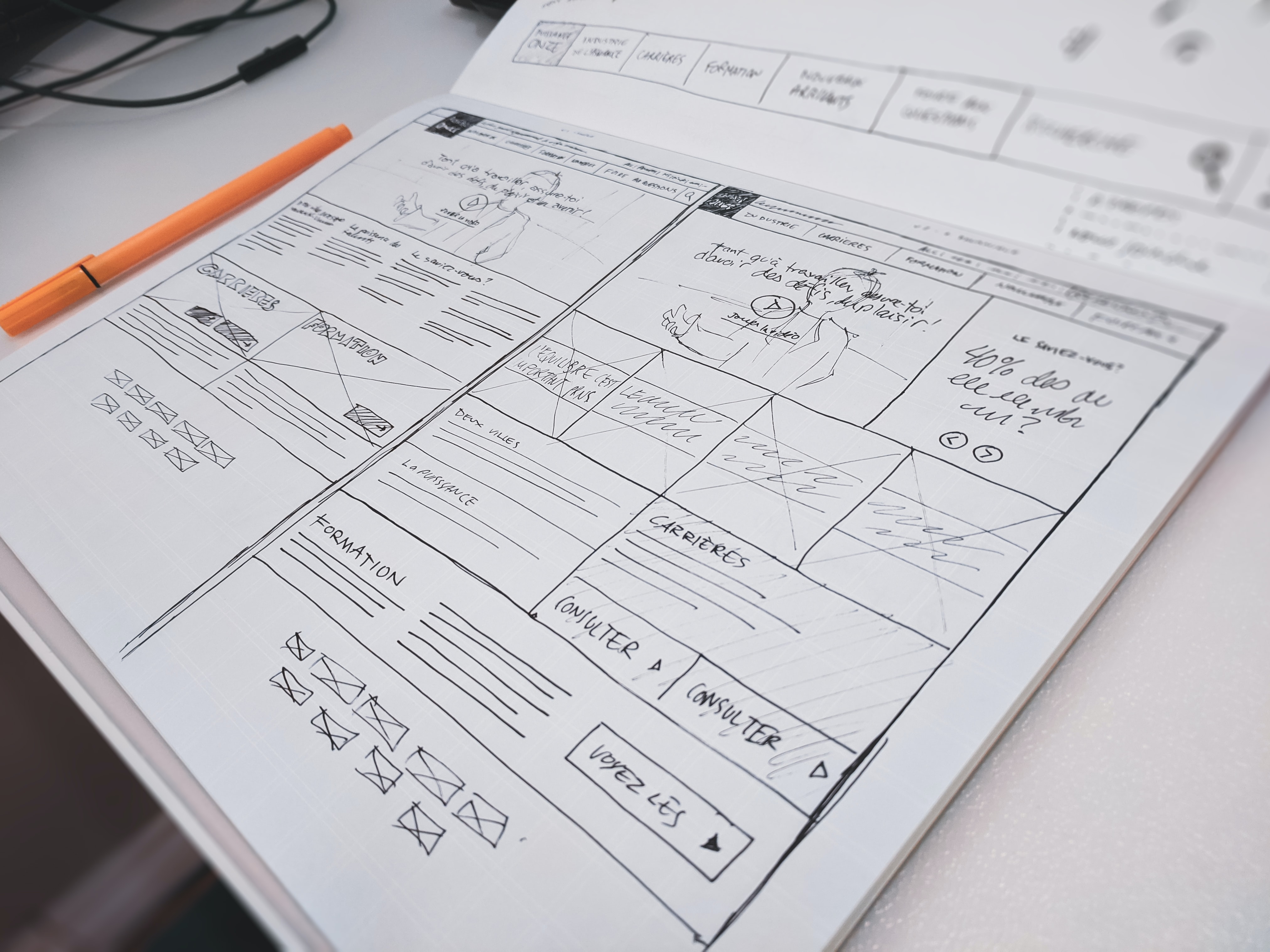
# Low Fidelity Wireframes
"Modularization" was the key of this rebuild project. Everything has to be flexible, from label, button, form, components, patterns, all the way up to a module level.
When we did the low fidelity wireframes, we took the boxing approach. We decided the box / module first, then work our way up.
# Feedback / Design Changes
# Positive
- Boxing / Modularization approach is good since we gotta divide the works to different team to work at the same time.
- Material design fits the company image.
- User flow is easy to follow and build.
# Negative
- Localization was a headache since some languages are left align, some are right align.
- Multi-talent 's UI/UX is not clear.
# Final Product
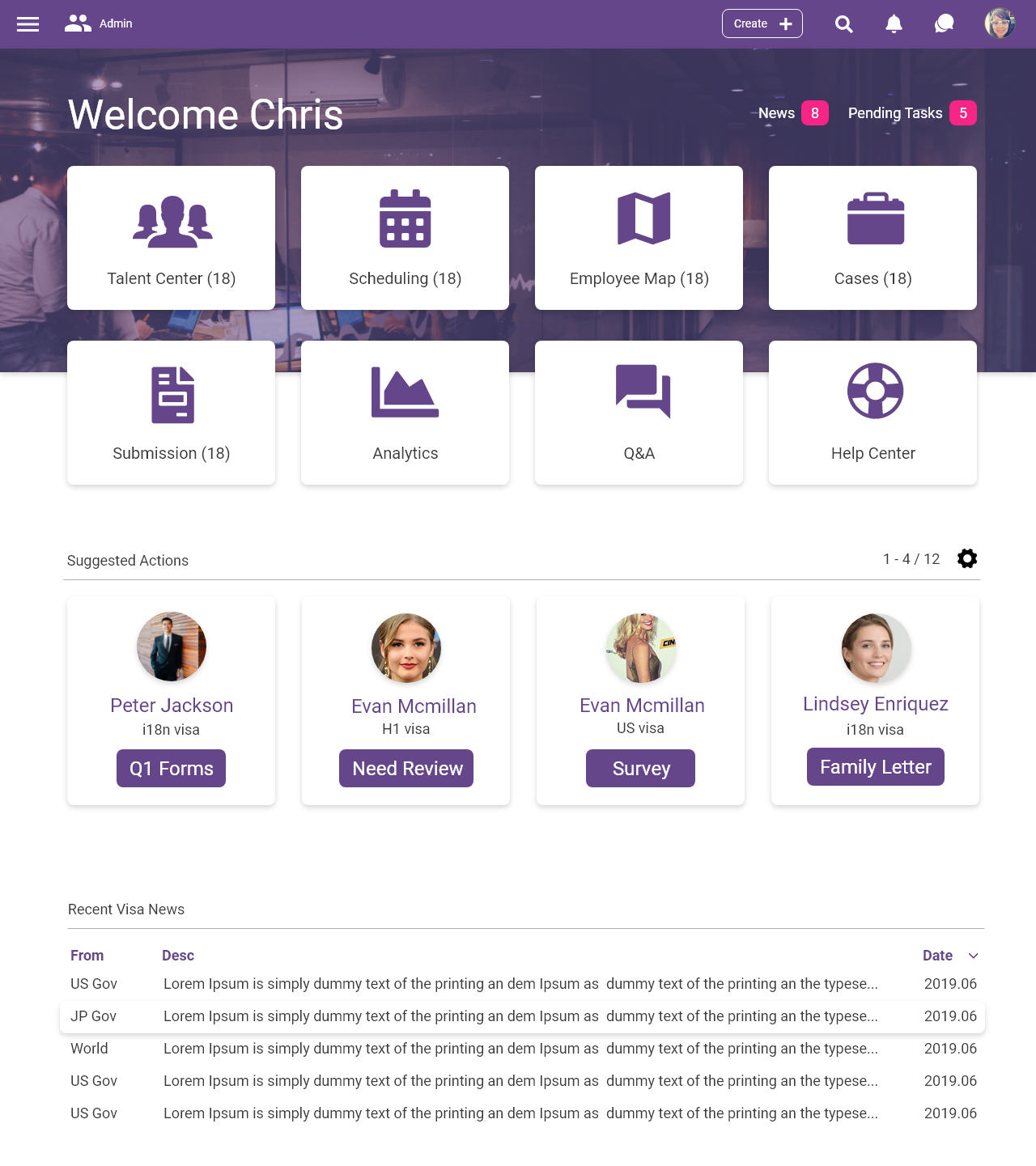
Desktop version - Homepage
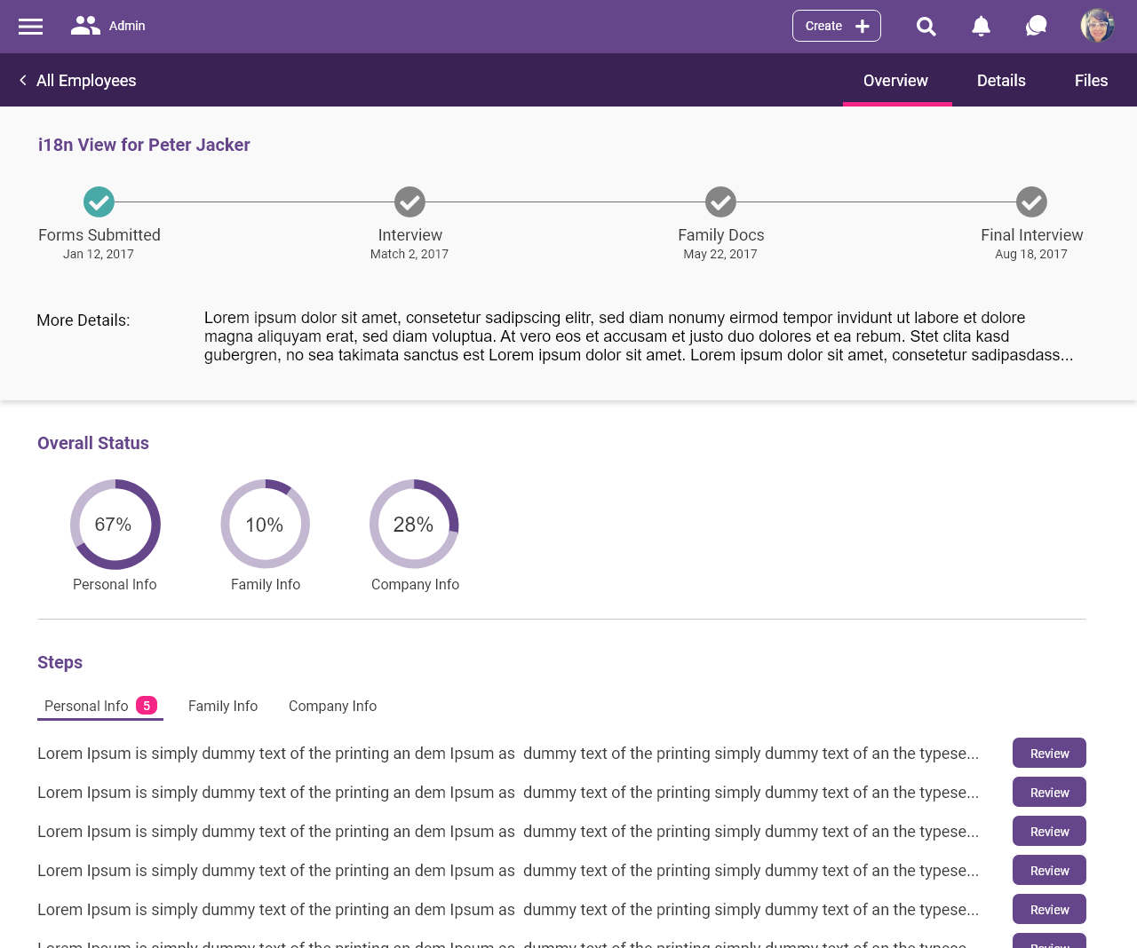
Desktop version - Employee Visa Status
# Retrospective
Challenges
Modularization and Localization were simply difficult.
Modularization : We had 30 people in together and gotta makde sure all teams could work at the same time. Collaboration was the key. Designers could not over-design. Developers could not over spend their time on coding as well. We missed few times in the Agile process but overall were good.
Localization : Few designers and developers did not have experience on localization, so both layout and FrontEnd code were a bit messy in few areas. We had bugs in non-modern browsers such as IE11. We needed to spend extra time at the end to fix up all those issues.
What can be improved?
For sure, we gotta improve on time estimate skill, specially for junior folks. People are smart, but they often forget about the time that they need at the end on clean-up and fixing bugs.
And for localization, senior designers and developers should take care those tasks, or, we should build few real world example components for others to follow. The process should go a bit smoother after.
Thank You.