# Migration Tracker
# The Project
The Product: Migration-Tracker is a powerful files migration big data tool which helps users on migrating and converting files between different formats and types.
The Problem(s): This product is full of features but it was made with NO GUI interface in mind. It offers no instant and useful feedback to the users. Oftentimes, users fail a migration process due to unknow reasons. Even worse, this tool doesn't offer migration progress and users cannot stop or pause it once they start the process.
Duration: 6 months
Role: UI/UX Architect (Design + FrontEnd Dev)
Team Size: 10 people (Me + 1 Junior FrontEnd Dev + 8 BackEnd Dev)
Methods: Surveys, Interviews, Card-Sort, Preference-Test, Wireframe, Prototyping.
Tools: Adobe XD, Electron, VueJS, Vuetifyjs, UsabilityHub.
# The Context
I recommended adding a web interface to present the big data for end users viewing to the company.
The end goal is to provide instant useful information to users which would guide them to make better decision on migration process. We believe better decision making in the tool will drive them to use the tool more, which will also drive more revenues for the company.
# Process
# End Users Interviews
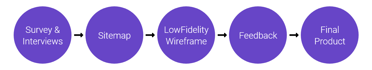
# Survey & Interviews
- What do you wanna see in a migration process?
Real time migration process! A easy to understand pie chart would be helpful, and be able to show memory usage would be nice too.
- What interest you the most and the worst?
Success and error count in the process. Hmmm.... The user who starts the process because usually only the admin would have right to do so.
- Once you start the migration process, what do you wanna know next?
Please somehow let me know if the process is running or not. Sometimes, a migration process would take up to a day and I need to know if the program is still running or bug out.
- How do you wanna run the migration process tracker tool? Desktop / Server / Mobile?
60% of the time, I will use it on Desktop Chrome browser. Of course if I can see the app on my iPad that would be nice. Most of our users are using iPad.
- Do you have internet connection when you run the migration?
It depends. Sometimes, I got all files sit on my laptop and I would like to run the migration process when I am on the train or taxi.
- What is the average age of this tool users?
Around 50. Please make the charts and texts bigger and easy to read.
- Tell me your experience about the last time you use the migration tool. Good and bad.
It works! And... the worst one was... the program bugs out in console for days and I didn't know what to do...
# Key Findings & Insights
- Keep things simple.
- Main users are on Chrome and iPad.
- Users might lose internet during migration process.
- Accessibility is important. Bigger fonts and images fit end users group better.
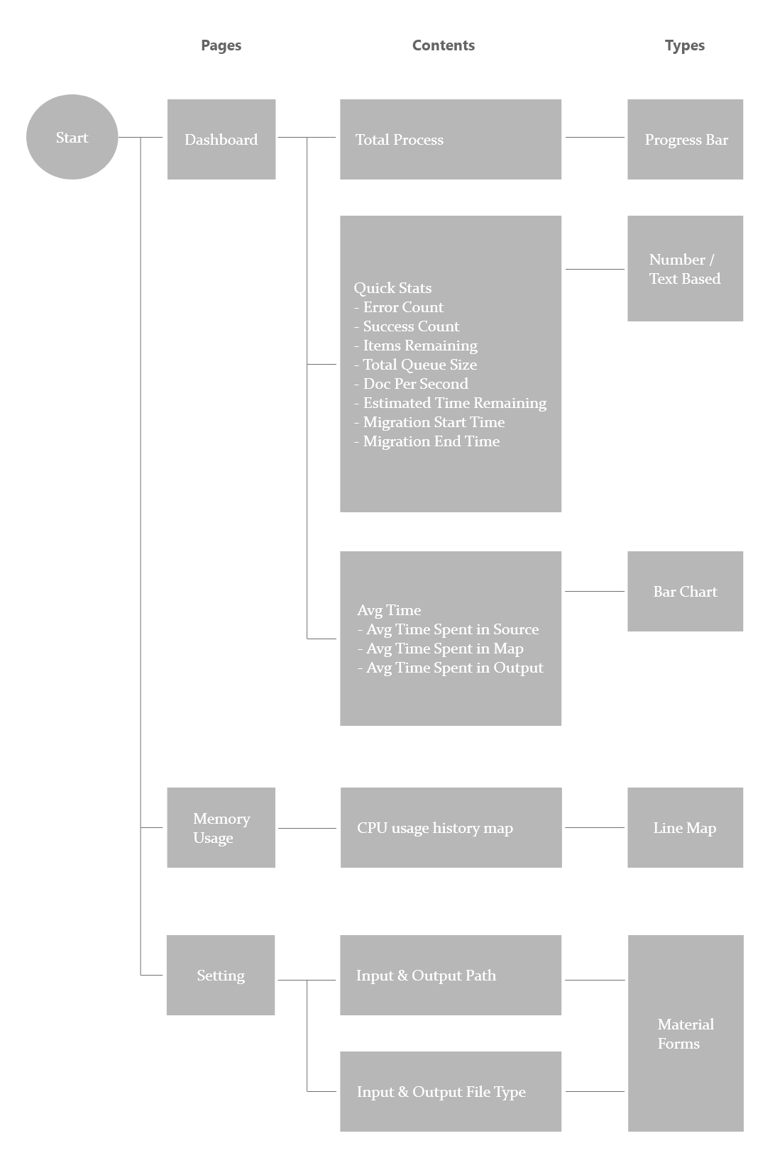
# Sitemap
With these core features and feedbacks in mind, I conducted a card-sort exercise to gain insight as to how users might expect the content to be organised and displayed, and used the results to create a sitemap.
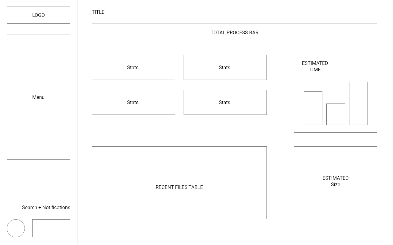
# Low Fidelity Wireframes
Since simplicity and ease of use / access are one of the biggest aims of Migration-Tracker, the number of widgets on homepage were kept to a minimum and I wanted to focus on highlighting the core features and numbers. I started with low fidelity wireframe to get the basic structure and requirement done first.
# Feedback / Design Changes
# Positive
- Everything users need is in one place.
- Using charts makes it easier and faster to understand the data.
- Layout is flexible for RWD.
# Negative
- Search and Notifications are difficult to see.
- Estimated-Time should not use Bar chart.
- Quick-Stats card sizing might be too big.
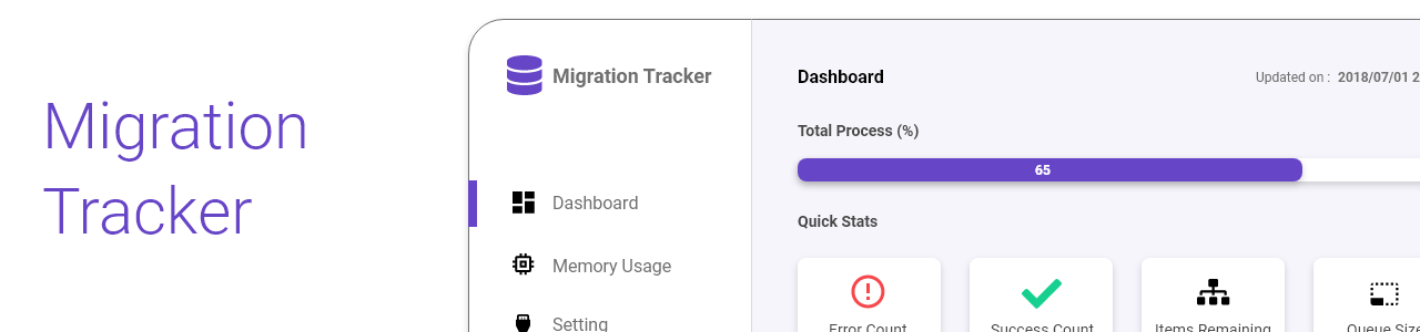
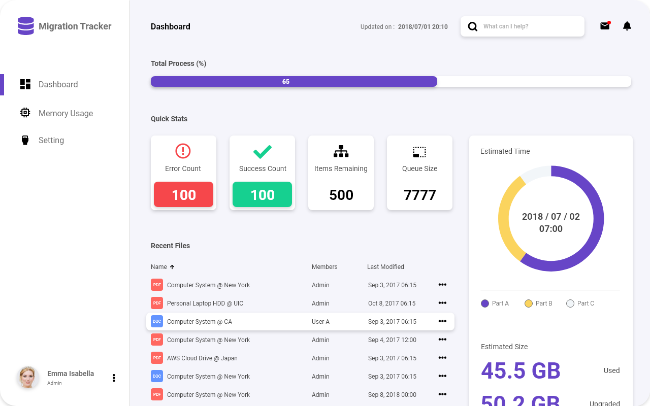
# Final Product
I made changes based on the user feedback and then reached out for additional feedback from developers as well. I created the high fidelity version of the app that featured more white space, new tool-bar, and better charts selection.
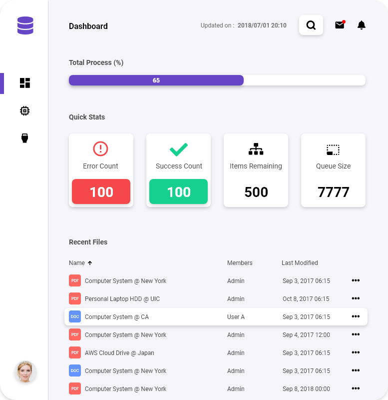
Desktop version
iPad version
# Retrospective
Challenges
The biggest challenge was a struggle with the timeline. The app was made with console users in mind, so the commends and data were tie up together pretty bad. We spent a lot of time on thinking and designing how to expose data and features via APIs to the app. This pushed back my timeline somewhat, and I could not spend enough time on the RWD design and coding.
What can be improved?
Even for old softwares, we cannot simply run away from it. We need to spend more time at first to understand its structure and functionality. When making schedule next time, we would keep this in mind for sure.
Thank You.