# Video Annotation
# The Project
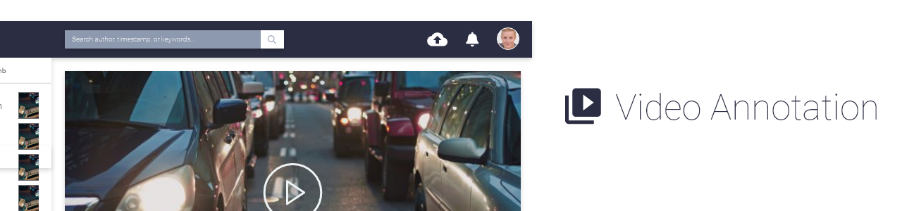
The Product: Video-Annotation is a web app that offers cost effective and ease-of-use on video and audio editing functionality.
The Problem(s): In traditional fashion, usually video camcorder or security camera comes with its own special software. End users have to use that particular software to do anything with the hardware, such as reading the file, import and export files, etc. It's not easy at all for anyone who would like to do editing on videos quickly. If you don't have access to that particular software then you are out of luck. We saw this business opportunities and developed video annotation application.
Duration: 4 months
Role: UI/UX Architect (Design + FrontEnd Dev)
Team Size: 6 people (Me + 1 Junior Designer + 2 Junior FrontEnd Dev + 2 Junior BackEnd Dev)
Methods: Surveys, User-Interview, Performance-Test, Wireframe, Prototyping.
Tools: Adobe XD, Bootstrap, AndularJS, Amazon AWS, UsabilityHub.
# The Context
We would like to change how people would do annotation on video and audio in general. We utilized Amazon web services to encode videos into web friendly format MP4, then we used a browser based video and audio editing web application to do the annotation works. Comparing to traditional way, it offers cost effective, ease-of-use, and flexibility.
# Process
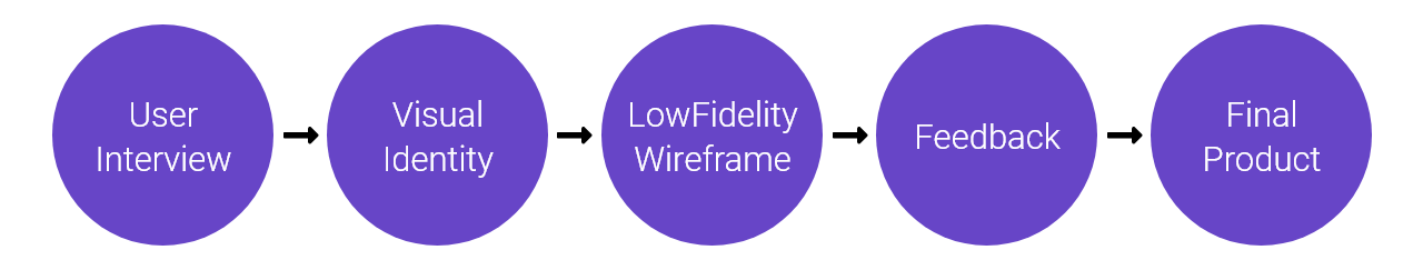
# User Interview

# Key Findings & Insights
- Prefer more business / stable color.
- Prefer general / common icons and buttons.
- Need to see annotation detail table and video at once on Desktop.
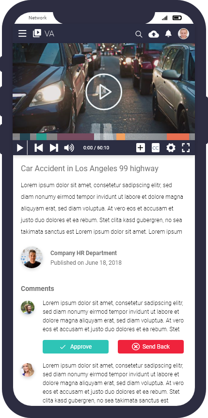
- On Mobile, focus on viewing experience first is fine.
- Need to have a easy way to upload new video anytime inside the app.
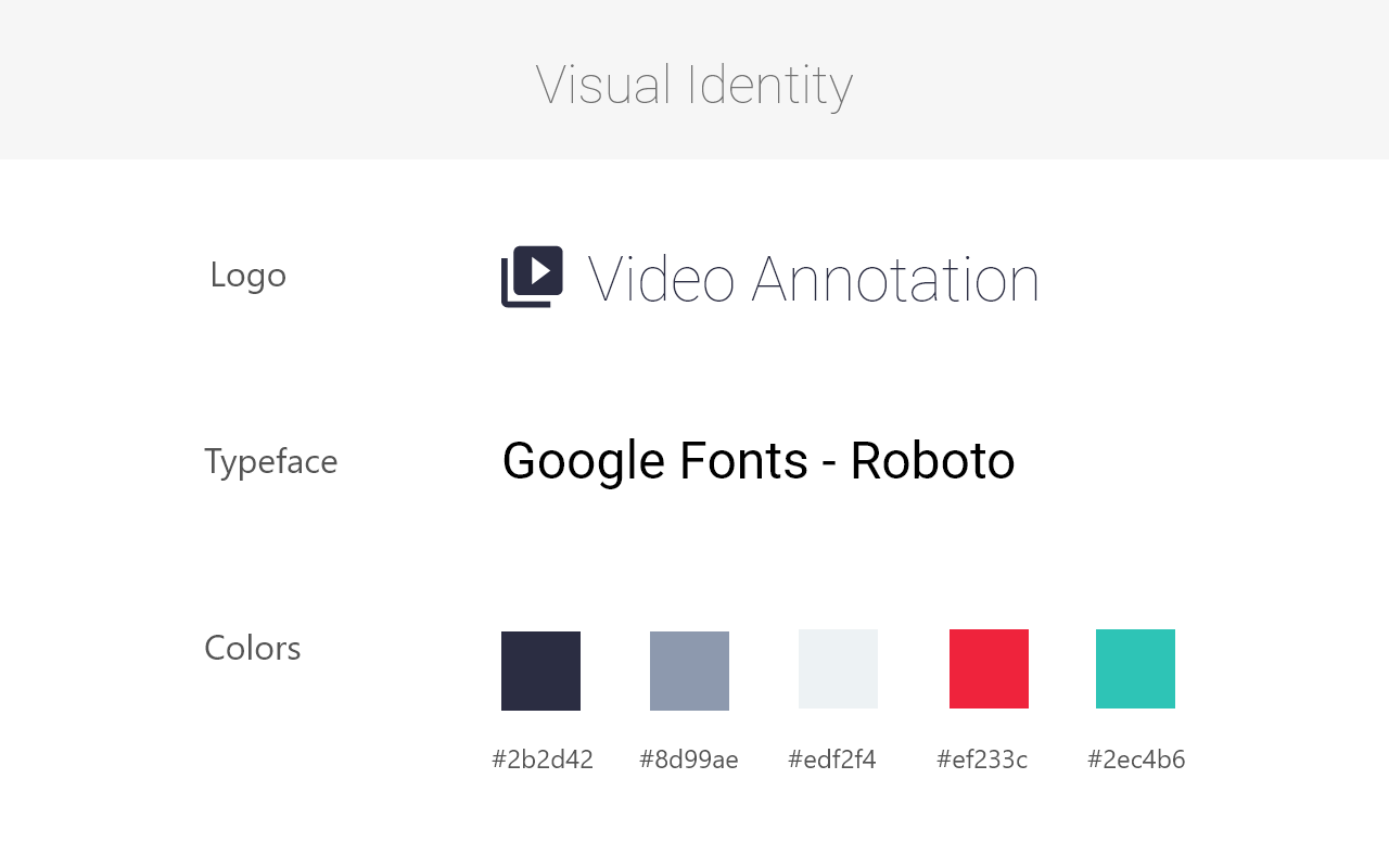
# Visual Identity
We studied our potential clients and found that their age group was around 40-50 years old. Most of them have been doing video annotation for over 10 years, and they would need to look at the screen for long hours daily.
With those details in mind, we decided to use simple font, general icons, and darker theme. On colors, since our potential users would need to look at screen for long hours so we picked darker and more stable colors to use through out the interface.
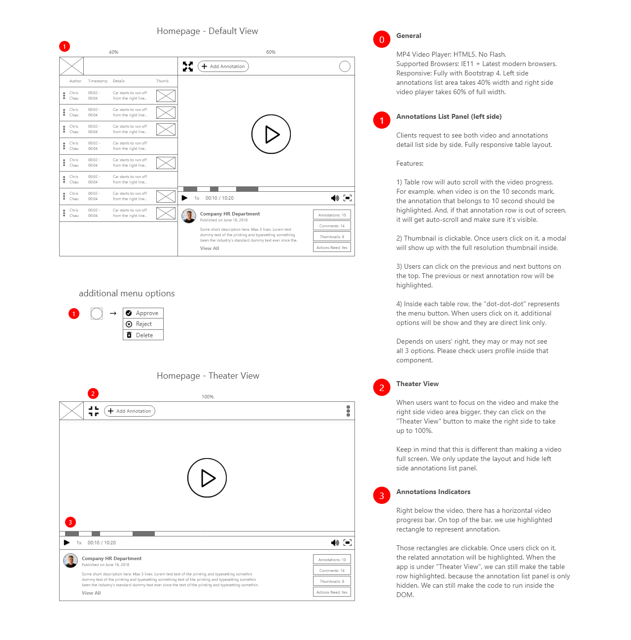
# Low Fidelity Wireframes
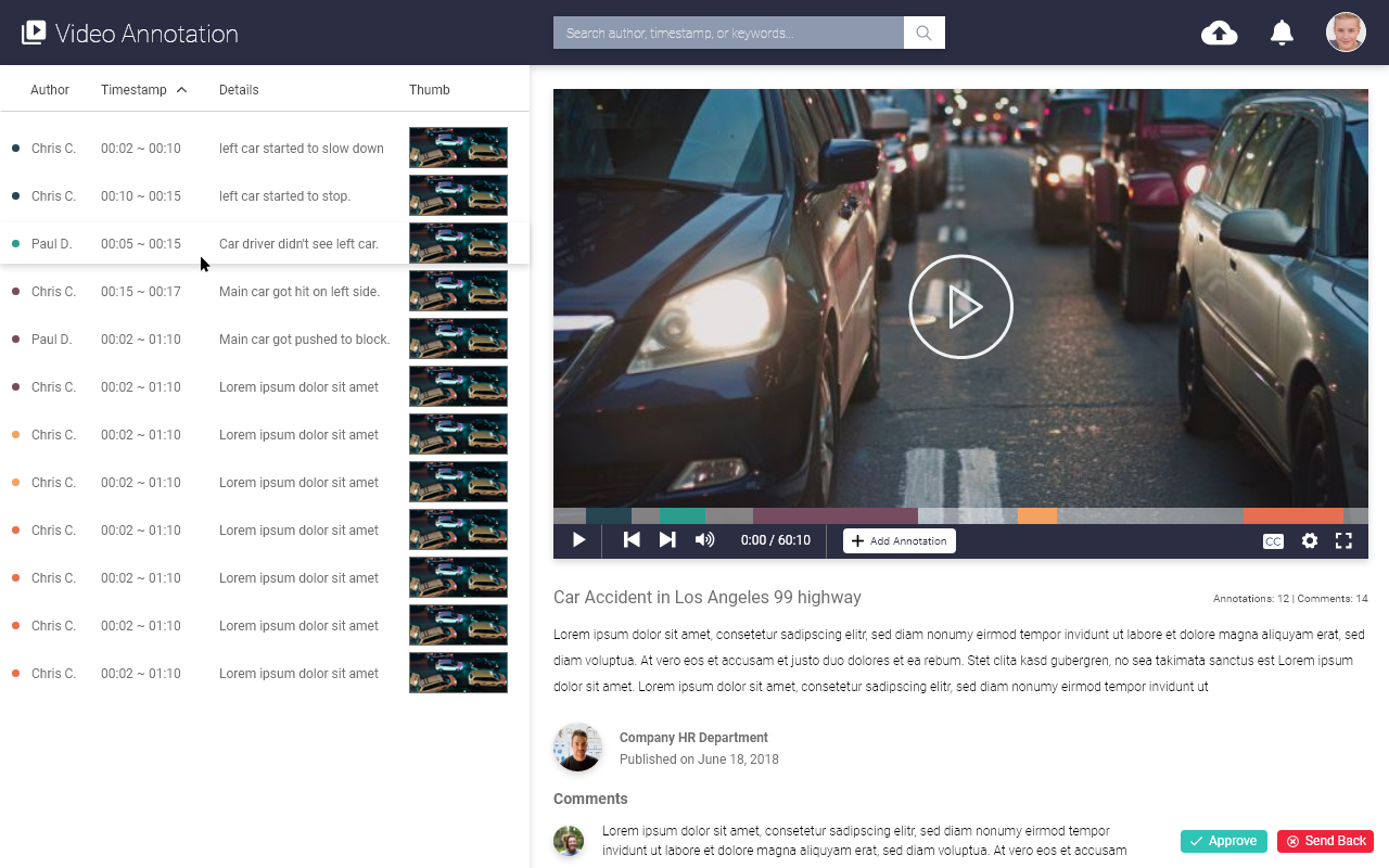
We kept generic and ease-of-use in mind when designing. We placed the annotation detail table on the side with the video player in the main area. Under Desktop, users would not need to move a lot to reach the features that they often use. For most common features, we design it with big icon and label so they are easy to understand and reach by users.
# Feedback / Design Changes
# Positive
- Be able to see annotation details and video at once.
- Annotation detail table offers screenshot which is helpful.
- UI is simple and full of features.
# Negative
- full-size-button and add-annotation-button are too close together and confusing.
- Video is often hours long so users would need next and previous chapter button.
- Video description area is too busy.
# Final Product
I made changes based on the user feedback then I created different versions of high fidelity wireframes of the app that featured better navigation, new navigation bar, and simpler video description area.
Desktop version
iPhone version
# Retrospective
Challenges
Since this app was built from the ground up, junior designer and developer had a hard time to understand the end goal of this product. We went back and forward on the application's interface and features few times during the early stages. We lost some times there, but luckily we were be able to catch up at the end.
What can be improved?
In those early stages meetings, we should have wrote down more on the backboard about what we understand and agree on. Especially for IT workers, we often forget paper and pens is the best tool for doing communication on ideas.
Thank You.